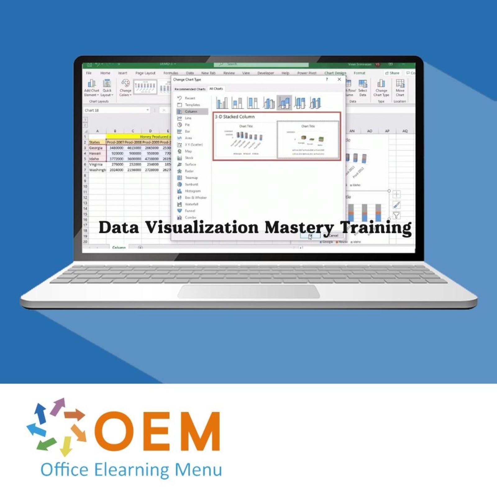
Data Visualization Mastery Training

Data Visualization Mastery Training
Data Visualization Mastery E-Learning Training Certified Teachers Exam Quizzes Assessments Test Exam Live Labs Tips Tricks Certificate.
Read more- Discounts:
-
- Buy 2 for €390,04 each and save 2%
- Buy 3 for €386,06 each and save 3%
- Buy 4 for €382,08 each and save 4%
- Buy 5 for €378,10 each and save 5%
- Buy 10 for €358,20 each and save 10%
- Buy 25 for €338,30 each and save 15%
- Buy 50 for €318,40 each and save 20%
- Availability:
- In stock
- Delivery time:
- Ordered before 5 p.m.! Start today.
- Award Winning E-learning
- Lowest price guarantee
- Personalized service by our expert team
- Pay safely online or by invoice
- Order and start within 24 hours
Data Visualization Mastery E-Learning Training
Master the art of data visualization and turn data into powerful insights.
Data visualizations are essential for making informed, data-driven decisions. This Skillsoft Aspire journey equips you with the skills to design clear, user-focused visuals, understand visualization best practices, and use top tools to communicate data effectively.
What you’ll learn:
- Best practices for creating impactful visualizations
- Create visuals and charts in Excel and QlikView
- Design interactive dashboards and compelling infographics
- Use Python libraries like Matplotlib, Plotly, and Bokeh
- Work with diverse data sources before visualizing them
This course is part of an Agile Learning Kit, with step-by-step modules, hands-on labs, mentoring, and 365-day access.
Why Choose This Training?
- Master data storytelling techniques
- Work with top tools like Excel, QlikView, and Python
- Build your own dashboards and visual insights
- Includes e-learning, practice labs, assessments & 365-day access
- Agile format for structured, real-world learning
Who Should Enroll?
This course is ideal for:
- Data analysts looking to visualize insights effectively
- Excel and BI users expanding into visual storytelling
- Python developers/data scientists communicating results visually
- Business professionals and decision-makers needing data clarity
Course content
This learning path, with more than 43 hours of online content, is divided into the following four tracks:
Track 1: Data Visualization with Excel
Track 2: Data Visualization with Bi Tools
Track 3: Creating Infographics for Data Visualizations
Track 4: Data Visualization with Python
Track 1: Data Visualization with Excel
In this track, the focus will be on data visualization best practices and data visualization using Microsoft Excel.
Content:
E-learning courses
Data Visualization: Best Practices for Creating Visuals
Course: 1 Hour, 4 Minutes
- Course Overview
- Importance of Data Visualization
- Best Practices for Data Visualization
- Chart and Presentation Types for Visualizing Data
- Use Cases: Tables and Bar Charts
- Use Cases and Best Practices: Line and Pie Charts
- Use Cases: Histograms and Box Plots
- Use Cases: Scatter Charts and Bubble Charts
- Use Cases: Gantt Charts and Waterfall Charts
- Heatmaps, Funnel, Sunburst, and Sankey Charts
- Course Summary
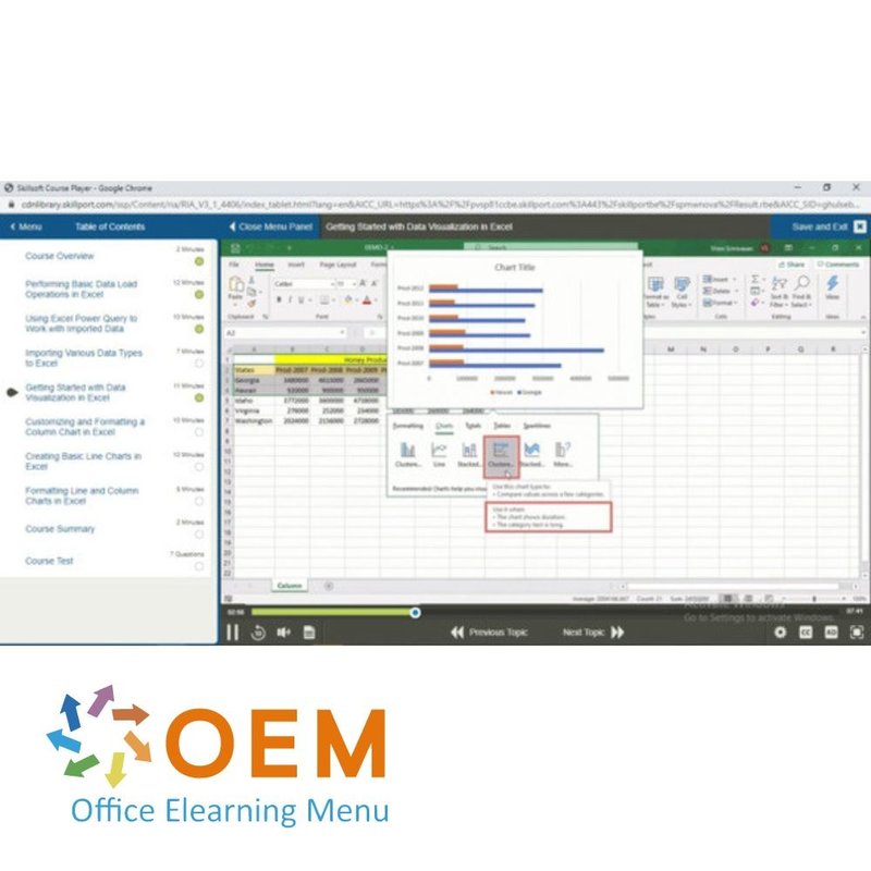
Excel Visualization: Getting Started with Excel for Data Visualization
Course: 1 Hour, 12 Minutes
- Course Overview
- Performing Basic Data Load Operations in Excel
- Using Excel Power Query to Work with Imported Data
- Importing Various Data Types to Excel
- Getting Started with Data Visualization in Excel
- Customizing and Formatting a Column Chart in Excel
- Creating Basic Line Charts in Excel
- Formatting Line and Column Charts in Excel
- Course Summary
Excel Visualization: Building Column Charts, Bar Charts, & Histograms
Course: 1 Hour, 18 Minutes
- Course Overview
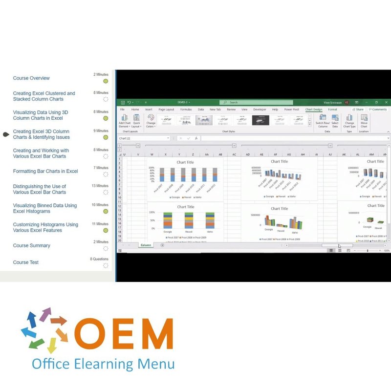
- Creating Excel Clustered and Stacked Column Charts
- Visualizing Data Using 3D Column Charts in Excel
- Creating Excel 3D Column Charts & Identifying Issues
- Creating and Working with Various Excel Bar Charts
- Formatting Bar Charts in Excel
- Distinguishing the Use of Various Excel Bar Charts
- Visualizing Binned Data Using Excel Histograms
- Customizing Histograms Using Various Excel Features
- Course Summary
Excel Visualization: Visualizing Data Using Line Charts & Area Charts
Course: 1 Hour, 39 Minutes
- Course Overview
- Visualizing Data Using Excel Line Charts
- Using Gradient Fill on Excel Line Charts
- Customizing and Formatting Excel Line Charts
- Using Linear Regression Trendlines on Line Charts
- Using Advanced Trendline Features on Line Charts
- Distinguishing Different Types of Excel Line Charts
- Creating Basic Area Charts in Excel
- Creating Stacked Area Charts in Excel
- Using 100% Stacked Area Charts in Excel
- Using 3D Area Charts in Excel
- Formatting the Walls in a 3D Area Chart
- Course Summary
Excel Visualization: Plotting Stock Charts, Radar Charts, Treemaps, & Donuts
Course: 1 Hour, 19 Minutes
- Course Overview
- Using High-Low-Close Charts for Financial Data
- Creating Candlestick Charts in Excel
- Visualizing Data Using Radar Charts in Excel
- Formatting and Customizing Radar Charts in Excel
- Visualizing Hierarchical Data Using Excel Treemaps
- Visualizing Proportions Using Pie Charts in Excel
- Using the Pie-of-pie and Bar-of-pie Charts in Excel
- Visualizing Proportions Using Doughnut Charts in Excel
- Course Summary
Excel Visualization: Building Box Plots, Sunburst Plots, Gantt Charts, & More
Course: 1 Hour, 40 Minutes
- Course Overview
- Displaying Statistics Using Box Plots in Excel
- Creating Multi-category Box-and-whisker Plots
- Creating Colored Box-and-whisker Plots in Excel
- Visualizing Hierarchical Data Using Sunburst Charts
- Visualizing Cumulative Data Using Waterfall Charts
- Visualizing Related Tasks Using Gantt Charts
- Creating Basic Band Charts in Excel
- Finding Relationships in Data Using Scatter Charts
- Measuring KPI Progress Using a Waffle Chart
- Course Summary
Online Mentor
You can reach your Mentor by entering chats or submitting an email.
Final Exam assessment
- Estimated duration: 90 minutes
Track 2: Data Visualization with BI Tools
In this track, the focus will be on data visualization using QlikView.
Content:
E-learning courses
QlikView: Getting Started with QlikView for Data Visualization
Course: 1 Hour, 52 Minutes
- Course Overview
- Installing QlikView on Microsoft Windows
- Illustrating How QlikView's Associative Model Works
- Importing Data into QlikView
- Working with Table Box Sheet Objects in QlikView
- Creating Bar Charts and Tables in QlikView
- Running QlikView Bar Chart Sort & Filter Operations
- Using Horizontal Bar Charts in QlikView
- Importing CSV Data into QlikView
- Creating Table Boxes and Multi Boxes in QlikView
- Using QlikView Pie Charts to Visualize Compositions
- Visualizing Data Using Grid Charts in QlikView
- Visualizing Data Using Trellis Charts in QlikView
- Course Summary
QlikView: Creating Line Charts, Combo Charts, Pivot Tables, & Block Charts
Course: 1 Hour, 45 Minutes
- Course Overview
- Creating and Formatting Line Charts in QlikView
- Applying Regression Using QlikView Trendlines
- Customizing Line Charts & Using QlikView Area Charts
- Creating Standard Combo Charts in QlikView
- Customizing Combo Charts in QlikView
- Create Stacked Bar Charts in QlikView
- Visualizing Hierarchical Data Using Pivot Tables
- Using Selected Data & QlikView Straight/Pivot Tables
- Visualizing Hierarchies Using QlikView Block Charts
- Creating Buttons in QlikView
- Course Summary
QlikView: Creating Mekko Charts, Radar Charts, Gauge Charts, & Scatter Charts
Course: 1 Hour, 38 Minutes
- Course Overview
- Using Mekko Charts in QlikView to Visualize Data
- Creating Line/Arrow Sheet Objects in QlikView
- Creating and Using Funnel Charts in QlikView
- Visualizing Data Using Gauge Charts in QlikView
- Customizing Gauge Charts in QlikView
- Working with Different Gauge Charts in QlikView
- Visualizing Data Using Radar Charts in QlikView
- Creating Scatter Charts in QlikView
- Customizing Scatter Charts in QlikView
- Using QlikView Animations, Search Bars, and Sliders
- Course Summary
Online Mentor
You can reach your Mentor by entering chats or submitting an email.
Final Exam assessment
- Estimated duration: 90 minutes
Practice Labs: Data Visualization with Excel and BI Tools (estimated duration: 8 hours)
Perform data visualization tasks with Excel such as creating and customizing line, bar, area and band charts. Then use QlikView to create tables and bar, combo, line and funnel charts. This lab provides access to tools typically used for data visualization, including:
- Microsoft Excel 2019
- QlikView 12
Track 3: Creating Infographics for Data Visualizations
In this track, the focus will be on creating infographics with Infogram and Visme.
Content:
E-learning collections
Infogram: Getting Started
Course: 1 Hour, 51 Minutes
- Course Overview
- Setting Up and Exploring Infogram
- Creating an Infogram Project
- Configuring Visual Elements in an Infogram Project
- Preparing Data for Infogram Charts
- Plotting a Line Chart in Infogram
- Configuring a Line Chart in Infogram
- Using Line Charts with Error Margins in Infogram
- Using Column Charts and Histograms in Infogram
- Using Stacked Bar Charts in Infogram
- 100% Stacked Bar Charts in Infogram
- Stacked Area Charts in Infogram
- Course Summary
Infogram: Advanced Features
Course: 1 Hour, 39 Minutes
- Course Overview
- Creating Animated Bar Races in Infogram
- Creating Candlestick Charts in Infogram
- Creating Waterfall Charts in Infogram
- Creating a Dashboard in Infogram
- Defining Interactions in Infogram Dashboards
- Creating an Infographic in Infogram
- Customizing Infographic Project Types in Infogram
- Adding Pie Charts and GIFs to Infogram Infographics
- Course Summary
Visme: Introduction
Course: 1 Hour, 17 Minutes
- Course Overview
- Getting Started with Visme
- Exploring Visme Templates for Social Media Posts
- Building an Infographic in Visme
- Configuring Shapes and Text in Visme Presentations
- Adding a Background Image to a Visme Infographic
- Adding a Video to a Visme Project
- Animating Visme Elements
- Course Summary
Visme: Exploring Charts
Course: 1 Hour, 7 Minutes
- Course Overview
- Adding a Bar Chart to a Visme Report
- Configuring a Visme Bar Chart
- Visualizing Data Using Visme's Horizontal Bar Charts
- Configuring Stacked Bar Charts in Visme
- Working with Pie and Donut Charts in Visme
- Visualizing Data Using Visme's Line and Area Charts
- Course Summary
Visme: Designing a Presentation
Course: 49 Minutes
- Course Overview
- Using Visme Templates to Create a Presentation
- Formatting Icons and Text in Visme
- Using Visme's Map Chart
- Sharing a Visme Project
- Course Summary
Online Mentor
You can reach your Mentor by entering chats or submitting an email.
Final Exam assessment
- Estimated duration: 90 minutes
Track 4: Data Visualization with Python
In this track, the focus will be on data visualization with Python using Matplotlib, Bokey, and Plotly.
Content:
E-learning collections
Python & Matplotlib: Getting Started with Matplotlib for Data Visualization
Course: 1 Hour, 44 Minutes
- Course Overview
- Installing Matplotlib
- Visualizing Random Data Using Line Charts
- Visualizing Time Series Data Using Line Charts
- Customizing Line Chart Elements
- Exploring the Use of Figure and Axes Objects
- Creating Line Charts Using the Twinx() Function
- Visualizing Data Using Histograms
- Customizing Histograms
- Comparing Categorical and Continuous Data
- Creating Lollipop Charts
- Creating Charts That Visualize Multiple Variables
- Course Summary
Python & Matplotlib: Creating Box Plots, Scatter Plots, Heatmaps, & Pie Charts
Course: 1 Hour, 29 Minutes
- Course Overview
- Visualizing Statistics Using Box-and-whisker Plots
- Customizing Box-and-whisker Plots in Matplotlib
- Visualizing Relationships Using Scatter Plots
- Visualizing Correlations Using Matplotlib Heatmaps
- Creating Labeled Heatmaps in Matplotlib
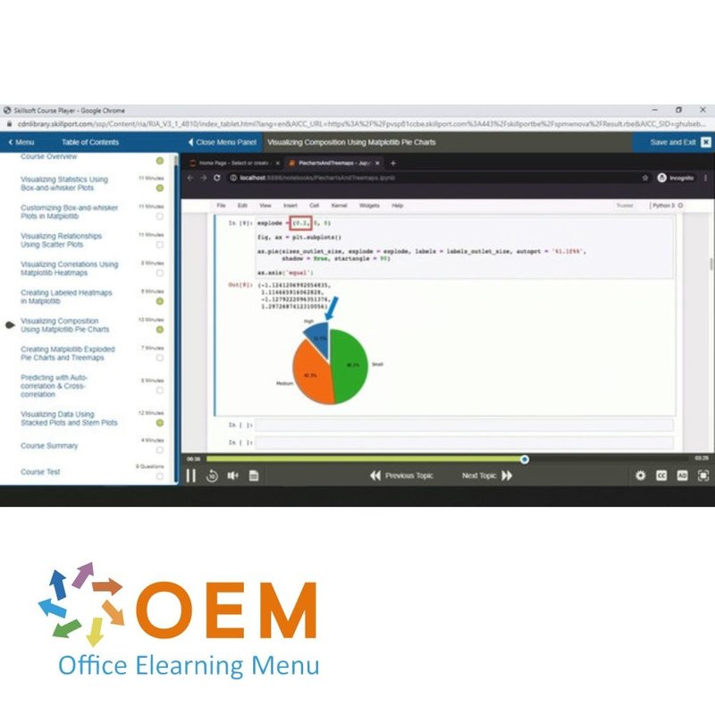
- Visualizing Composition Using Matplotlib Pie Charts
- Creating Matplotlib Exploded Pie Charts and Treemaps
- Predicting with Auto-correlation & Cross-correlation
- Visualizing Data Using Stacked Plots and Stem Plots
- Course Summary
Data Visualization: Building Interactive Visualizations with Bokeh
Course: 1 Hour, 6 Minutes
- Course Overview
- Installing Bokeh
- Saving Bokeh Charts as PNG and HTML Files
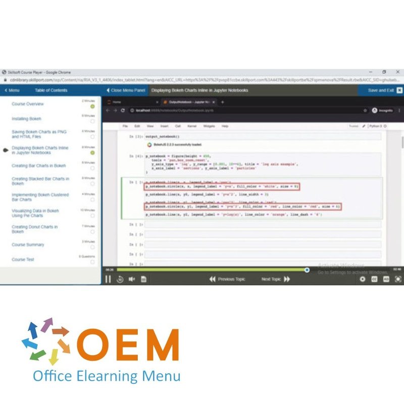
- Displaying Bokeh Charts Inline in Jupyter Notebooks
- Creating Bar Charts in Bokeh
- Creating Stacked Bar Charts in Bokeh
- Implementing Bokeh Clustered Bar Charts
- Visualizing Data in Bokeh Using Pie Charts
- Creating Donut Charts in Bokeh
- Course Summary
Data Visualization: More Specialized Visualizations in Bokeh
Course: 1 Hour, 8 Minutes
- Course Overview
- Creating Scatter Plots Using Bokeh
- Visualizing Relationships with Bokeh Scatter Plots
- Customizing Scatter Plots in Bokeh
- Visualizing Data Using Bokeh Heatmaps
- Creating Line Charts in Bokeh
- Customizing Line Charts with Area Charts in Bokeh
- Visualizing Data Using Bokeh Network Charts
- Course Summary
Data Visualization: Getting Started with Plotly
Course: 1 Hour, 9 Minutes
- Course Overview
- Installing Plotly
- Components of Plotly Graphs
- Creating Box Plots in Plotly
- Plotting Categorical Data with Box and Strip Plots
- Customizing Plotly Box Plots
- Visualizing Financial Data Using Candlestick Charts
- Visualizing Data Using Plotly Funnel Charts
- Course Summary
Data Visualization: Visualizing Data Using Advanced Charts in Plotly
Course: 1 Hour, 10 Minutes
- Course Overview
- Creating Radar Charts in Plotly
- Components of Plotly Radar Charts
- Visualizing Hierarchical Data Using Sunburst Charts
- Visualizing Schedules in Plotly Using Gantt Charts
- Creating Sankey Diagrams in Plotly
- Visualizing Data Using Plotly Sankey Diagrams
- Visualizing Geographical Data Using Plotly Maps
- Course Summary
You can reach your Mentor by entering chats or submitting an email.
Final Exam assessment
- Estimated duration: 90 minutes
Practice Labs: Creating Infographics and Data Visualization with Python (estimated duration: 8 hours)
Perform data visualization tasks such as creating an Infogram project, building an infographic and creating box-and-wisker plots, line charts and histograms. Then visualize relationships using a scatter plot, create a bar chart using Bokeh, and create a box chart using Plotly. This lab provides access to tools typically used for data visualization, including:
- Jupyter Notebook
- matplotlib
- numpy
- pandas
- Plotly
- Bokehh
| Language | English |
|---|---|
| Qualifications of the Instructor | Certified |
| Course Format and Length | Teaching videos with subtitles, interactive elements and assignments and tests |
| Lesson duration | 43 Hours |
| Assesments | The assessment tests your knowledge and application skills of the topics in the learning pathway. It is available 365 days after activation. |
| Online Virtuele labs | Receive 12 months of access to virtual labs corresponding to traditional course configuration. Active for 365 days after activation, availability varies by Training |
| Online mentor | You will have 24/7 access to an online mentor for all your specific technical questions on the study topic. The online mentor is available 365 days after activation, depending on the chosen Learning Kit. |
| Progress monitoring | Yes |
| Access to Material | 365 days |
| Technical Requirements | Computer or mobile device, Stable internet connections Web browsersuch as Chrome, Firefox, Safari or Edge. |
| Support or Assistance | Helpdesk and online knowledge base 24/7 |
| Certification | Certificate of participation in PDF format |
| Price and costs | Course price at no extra cost |
| Cancellation policy and money-back guarantee | We assess this on a case-by-case basis |
| Award Winning E-learning | Yes |
| Tip! | Provide a quiet learning environment, time and motivation, audio equipment such as headphones or speakers for audio, account information such as login details to access the e-learning platform. |
There are no reviews written yet about this product.
OEM Office Elearning Menu Top 2 in ICT-trainingen 2024!
OEM Office Elearning Menu is trots op de tweede plaats in de categorie ICT-trainingen 2024 bij Beste Opleider van Nederland (Springest/Archipel). Dank aan al onze cursisten voor hun vertrouwen!
Reviews
There are no reviews written yet about this product.


